SenseTime’s design reference, redesigned
I designed the reference and reading pages in a four-person team. Launched internally.

The project
SUXD is SenseTime’s internal design reference. Version 2.0 reorganized it around finding resources and reading guidance. From May to July 2021, I worked in a four-person design team on research, personas, competitive analysis, and the text-heavy pages.
My role
UX Designer · team of 4
Status
Internal launch
Useful guidance needs to be easy to find and read
People used SUXD for design guidance, components, and resources. Interviews identified two obstacles: unclear navigation made content hard to find, and dense layouts made it hard to read.
The research covered 10 colleagues: three designers, two product managers, and five engineers. I contributed to the research and personas, then focused on the design-system, component, and article pages.
Loading image…
3 designers
- What they needed
- Design language, specifications, and reusable resources
- Design implication
- Make guidance readable and easy to revisit.
2 product managers
- What they needed
- Reference material and practical templates
- Design implication
- Name destinations by the task they support.
5 engineers
- What they needed
- Component guidance and usable icon resources
- Design implication
- Connect reference content to implementation needs.
| Participants | What they needed | Design implication |
|---|---|---|
| 3 designers | Design language, specifications, and reusable resources | Make guidance readable and easy to revisit. |
| 2 product managers | Reference material and practical templates | Name destinations by the task they support. |
| 5 engineers | Component guidance and usable icon resources | Connect reference content to implementation needs. |
Qualitative synthesis of interviews with 10 colleagues.
Product positioning
Make design resources the starting point
The research positioned SUXD around reference and service, with articles and team information supporting that purpose. The redesign needed to clarify what the platform was for before adding more content.
Home brings together the design system, components, resources, articles, the online design platform, and team information.
Use labeled tabs for Images and Icons
The old Images/Icons switch did not clearly communicate its behavior. The iteration made the two destinations explicit with labeled tabs and a visible selected state.


The label and the selected state describe the same choice.
Images and Icons: a switch compared with two labeled tabs.
Resolve the reading structure before the visual treatment
The wireframes explore a persistent navigation rail, a clear content hierarchy, and reusable reading layouts across documentation and articles.
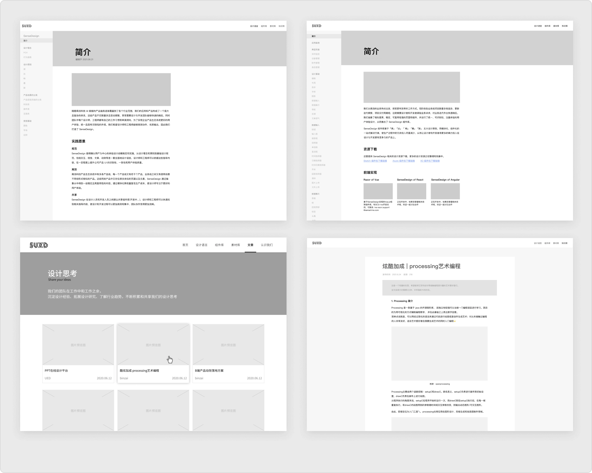
The navigation rail and written guidance establish the reference structure.
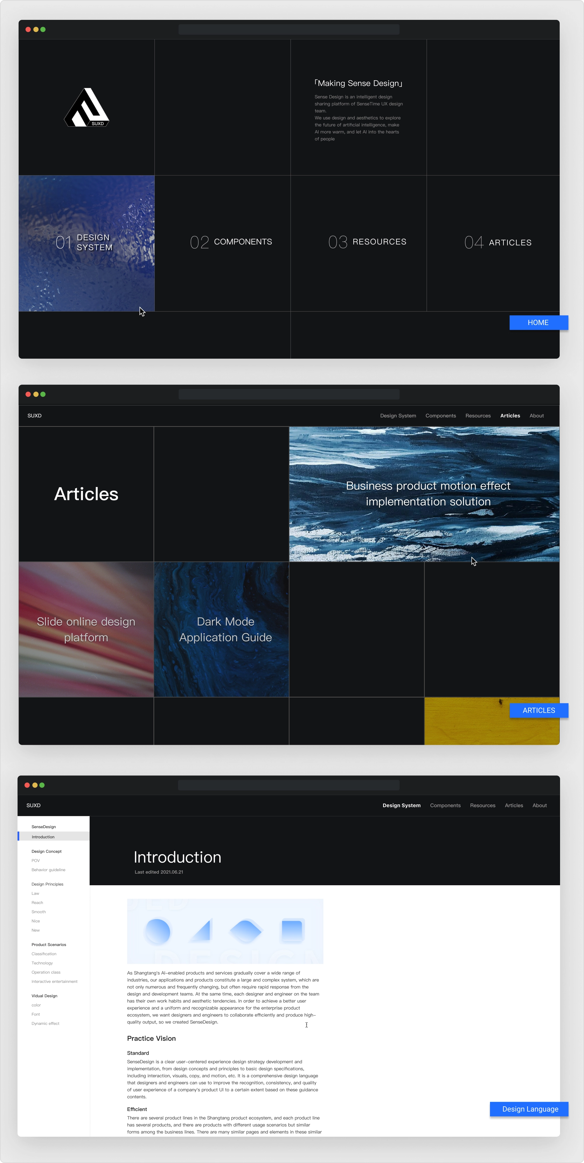
The prototype retains that structure and adds the visual foundations.
Keep the reference structure while resolving the visual hierarchy.
Structure and visual hierarchy across the 2021 design boards.
Set a readable width for articles
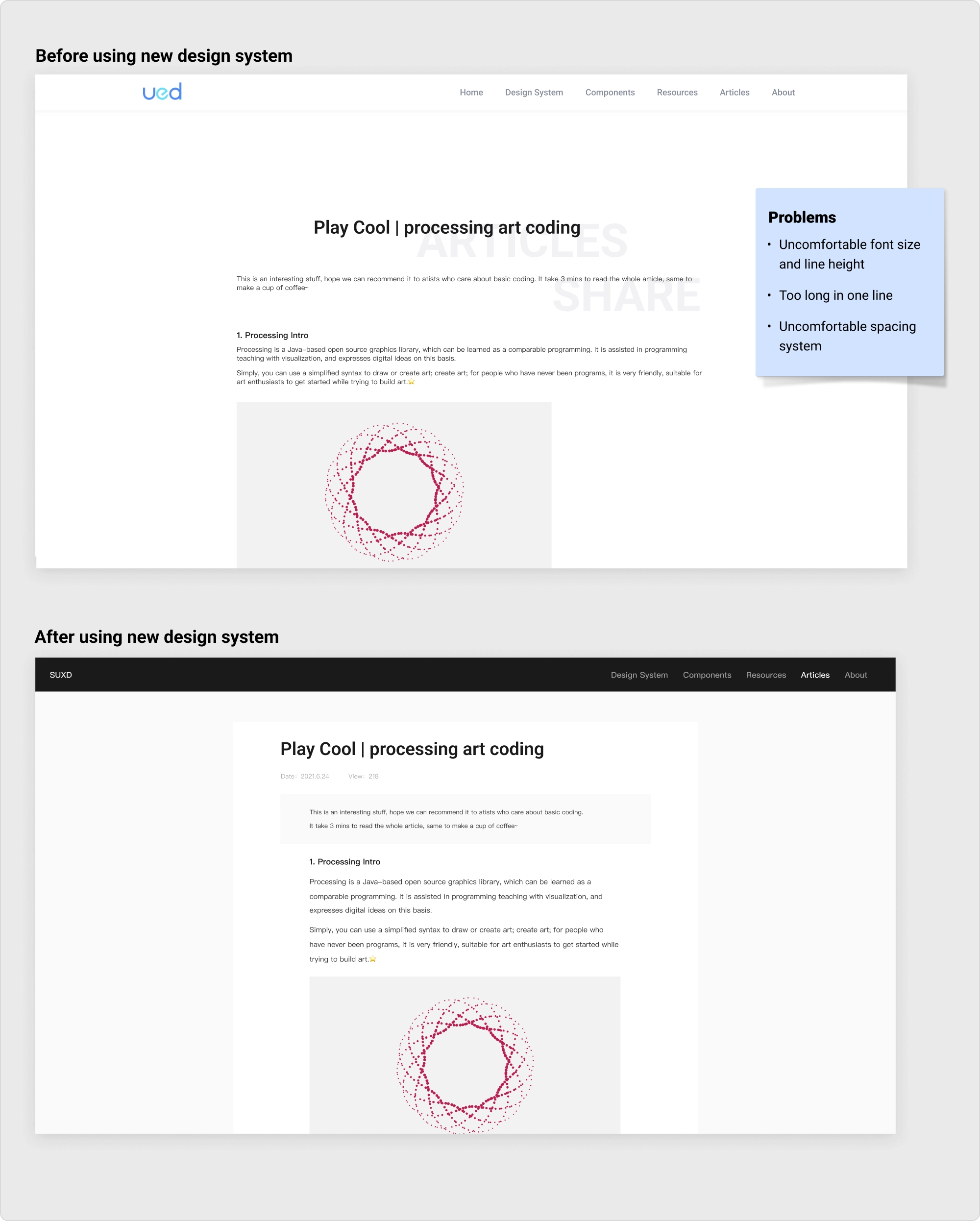
This is the same SUXD article before and after the 2021 redesign. Compare three things: the width of the body text, the space between lines, and the gaps around headings and images.
Long, tightly packed lines stretch across the page. Uneven gaps separate the introduction, heading, and body.
A narrower column, larger body text, and more open lines give the article a clearer hierarchy.
2021 article redesign · a clearer text column and more generous spacing.
Design system
Use shared rules across the resource platform
The design system combines PingFang SC typography, a neutral palette, and an eight-point spacing foundation. Repeated controls — tabs, pagination, and resource previews — carry the same hierarchy into different sections.
SUXD / neutral foundation
PingFang SC
Spacing, in steps of eight
Controls that name the task
The design-system, component, and article pages
Each module below shows how the text-heavy pages support reference and reading.
Design language
Component library
Article list and reading
Readable pages need useful content behind them
SUXD 2.0 launched internally with revised resource navigation and reading layouts. Usage data is not public.
What I carried forward: a reference platform needs both readable design and a sustainable supply of useful material. The interface should make that material easier to find, understand, and reuse.
More case studies
All workReturning to the Old Summer Palace
Stage visuals and motion for Renwen Tsinghua’s lecture on the palace’s reconstruction.
Animated stickers for a veterinary brand
Five WeChat characters, each built around one of the brand’s products.
Land access for Chicago growers
I researched, designed, and built a live directory helping Chicago growers compare land providers and understand how to apply.