Returning to the Old Summer Palace
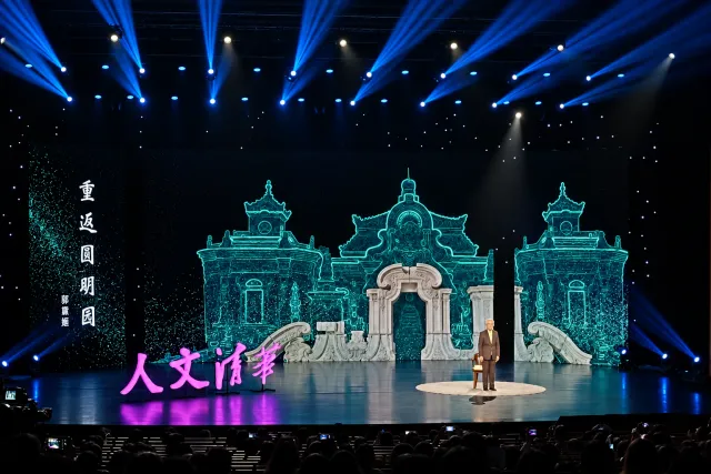
Stage visuals and motion for Renwen Tsinghua’s lecture on the palace’s reconstruction.
The project
Renwen Tsinghua (人文清华) is Tsinghua University’s TED-style humanities lecture series. For the episode 重返圆明园 — Professor Guo Daiheng on her reconstruction of the Old Summer Palace — I designed the motion background and the lecture plates that ran behind her on three screens.
My role
Visual & Motion Designer
Status
Delivered
Design for the auditorium and the broadcast
Nothing about this project started on a canvas. It started with three LED panels on the stage of Xin Qinghua Xuetang, Tsinghua’s 2,011-seat auditorium: a center screen about 7 meters across and two side panels 2 meters wide, each 5 meters tall, behind a speaker who is 1.7 meters tall. At that scale a decorative flourish becomes a wall, and a paragraph of type is unreadable from the balcony.
The second number mattered more. In October 2020 the brief expected about 150 people in those 2,011 seats, and 97 came. Everyone else watched a camera feed. The room I was designing for was mostly a broadcast.
Design the screen hierarchy around the room and the broadcast. The opening sequence, shown later in this case, demonstrates the delivered artwork in motion.
Why key information stayed off the side screens
From the wings of the stalls the side panels are seen at a sharp angle and partly occluded by the people in front — and on the broadcast they are often outside the frame entirely. Anything the audience had to read would have reached only part of the room, so both panels were given the same job for the whole lecture: hold the period, and stay still.
The problem
How do you bring a lost palace to the stage faithfully?
Stage 01
Source material
Secure the studio’s reconstruction drawings
Professor Guo’s studio had spent close to 20 years on the reconstruction: historical research, survey data, and digital models of buildings that are now foundations and rubble. The fast route was to illustrate the palace myself. Instead I spent about half a month negotiating access, and the studio authorized us to use the reconstruction drawings themselves.
Use the reconstruction research itself so the stage visuals support the lecture’s evidence.
- Benefit
- What the audience sees is the research being described — survey-derived models, ruin photography, and the Qing court’s own Yangshi Lei drawings.
- Trade-off
- Half a month of negotiation before a frame could be drawn, and the visual language then had to follow material I did not control.
DecisionUse the studio’s reconstruction
Preserve the visual character of the reconstruction research.
That choice shaped the visual system: the stage uses the studio’s reconstruction work, adapted for projection and broadcast.
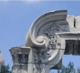
What survived The ruins the audience already knows.

What was reconstructed The studio’s digital model, built from survey and archive.

How it arrives Particles: the model read as data, not as memory.

Where it came from Yangshi Lei drawings, the Qing court’s own architectural records. They became the side panels.
Stage 02
Palette
Use teal to connect research imagery with a historical setting
The theme the director and I agreed on was past and present, and the palette had to carry both halves at once. A warm heritage scheme would have made the reconstruction look like a painting; a cold technical blue would have made a Qing garden look like a CAD file. The system settled on a heavy teal-green, deep enough to sit behind a lit speaker and saturated enough to survive a camera.
Renwen Tsinghua
Stage 03
The opening
Show the ruins and reconstruction in a 30-second opening
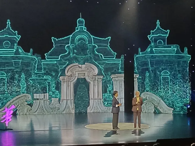
The sequence starts with what the audience already knows: the limestone arch of the Dashuifa fountain (大水法), the postcard image of the ruins. It holds there. Then particles gather behind the stone and the reconstructed palace resolves out of them — present, luminous, and unmistakably not a photograph. The ruins never move. The building arrives behind them and stays behind them.
The particles are the part people ask about. They are doing the honest work in the sequence: they say the building is being computed, from survey and from documents, rather than remembered. That is also the difference between this and a restoration rendering.
Stage 04
The plates
Keep lecture content on the center screen
After the opening, the center screen belongs to the lecture: the Forty Views paintings, plans, portraits, and the reconstruction models, each held on a ground that lets the original keep its own color. The side panels do not change. A viewer who looks away and back can always tell which screen to read.
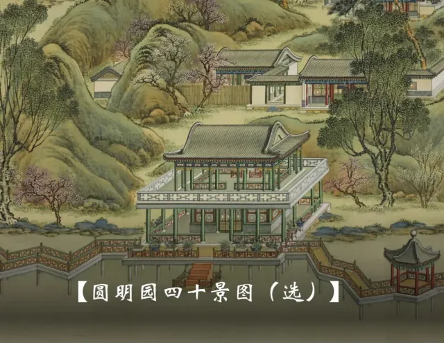
Painting Full screen; the caption sits inside the image.
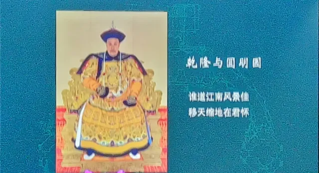
Portrait On the teal ground, text set beside it. Photographed on the night.
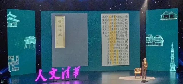
Document The page and its transcription, side by side. Photographed on the night.
Working alongside the speaker’s material
Professor Guo brought her own research imagery, so the slides were not a design artifact she had to fit into. My job was a container that stayed out of the way: consistent plate margins, one caption position, and a ground per image type. Where she needed a sequence explained, I animated it.
97 people in the room, and the rest of the audience on a feed
The lecture ran on October 20, 2020, the 160th anniversary of the destruction of the garden. My own project record notes 97 people in the hall and 2,342 on the broadcast; Tsinghua’s published account of the evening puts the combined audience at close to 800,000 online and offline. The organizer and the speaker were satisfied enough to commission me for the following three lectures in the program, each with its own visual system.

Returning to the Old Summer Palace
My project record
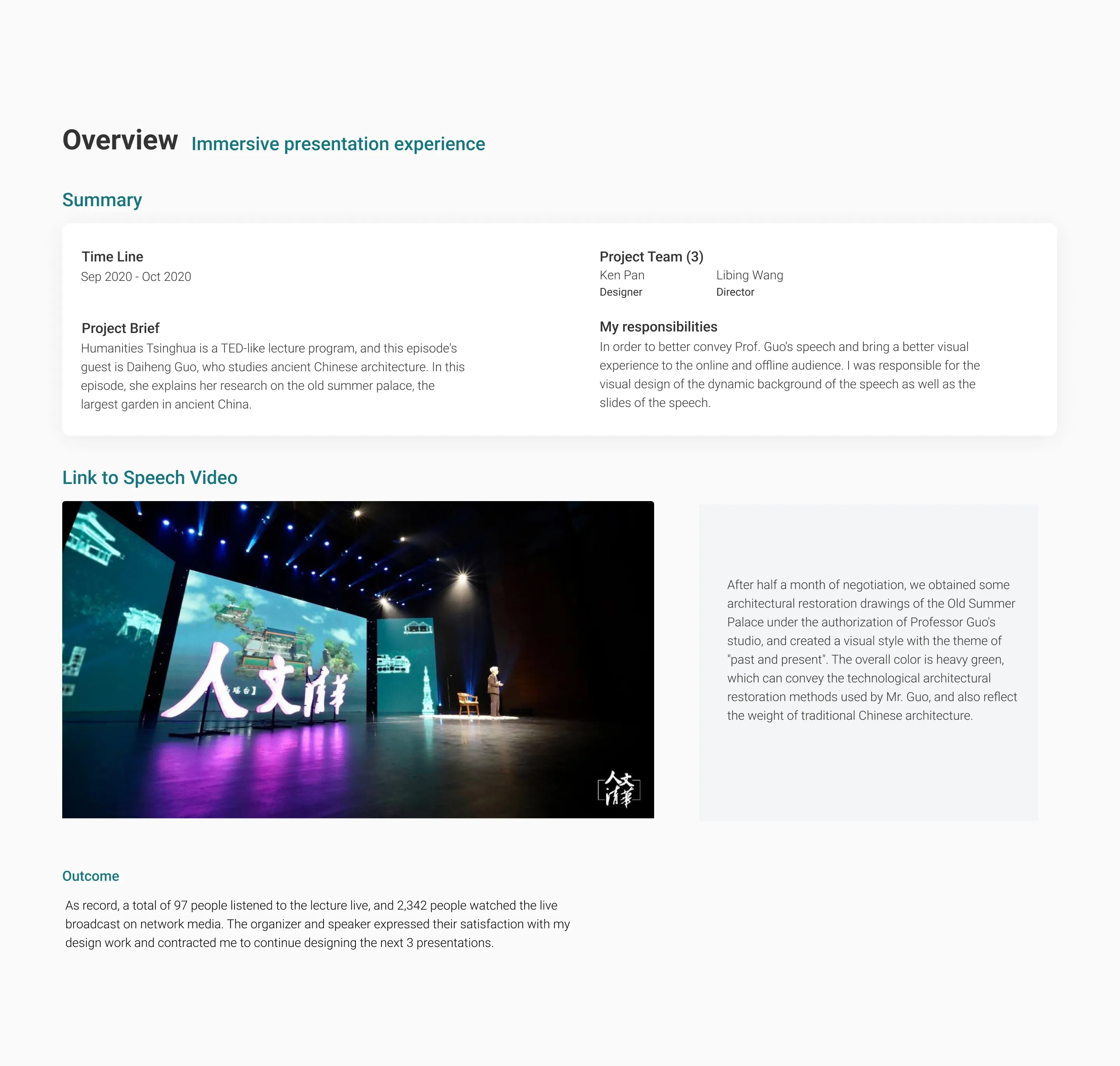
The part I would carry forward is the sourcing, not the styling. Half a month of negotiation bought a set of images no illustration budget could have produced, and it settled the honesty question the subject raises — the audience sees the reconstruction as a reconstruction.
Watch the lecture
Bilibili · YouTube · Tsinghua University’s account of the lecture
More case studies
All workAnimated stickers for a veterinary brand
Visual storytellingFive WeChat characters, each built around one of the brand’s products.
Land access for Chicago growers
I researched, designed, and built a live directory helping Chicago growers compare land providers and understand how to apply.
From tabs to ideas
I designed this research canvas from 0→1 as the solo product designer. Launched on desktop and web.