Land access for Chicago growers
I researched, designed, and built a live directory helping Chicago growers compare land providers and understand how to apply.

The project
I researched, designed, and built Chicago Land Access Pathways (CLAP) to help urban growers find a suitable institution and understand its land-application process.
My role
UX Engineer
Status
Live
Find the institutions that can help with land access
Our research identified the lack of stable, long-term land access as a major obstacle for urban growers. Institutions held useful information, but their eligibility rules, land-use conditions, and application processes were scattered across different sources.
The design challenge was to make those pathways understandable before a grower invested time in contacting an institution.
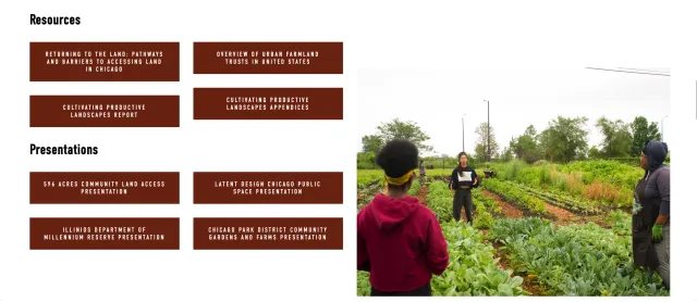
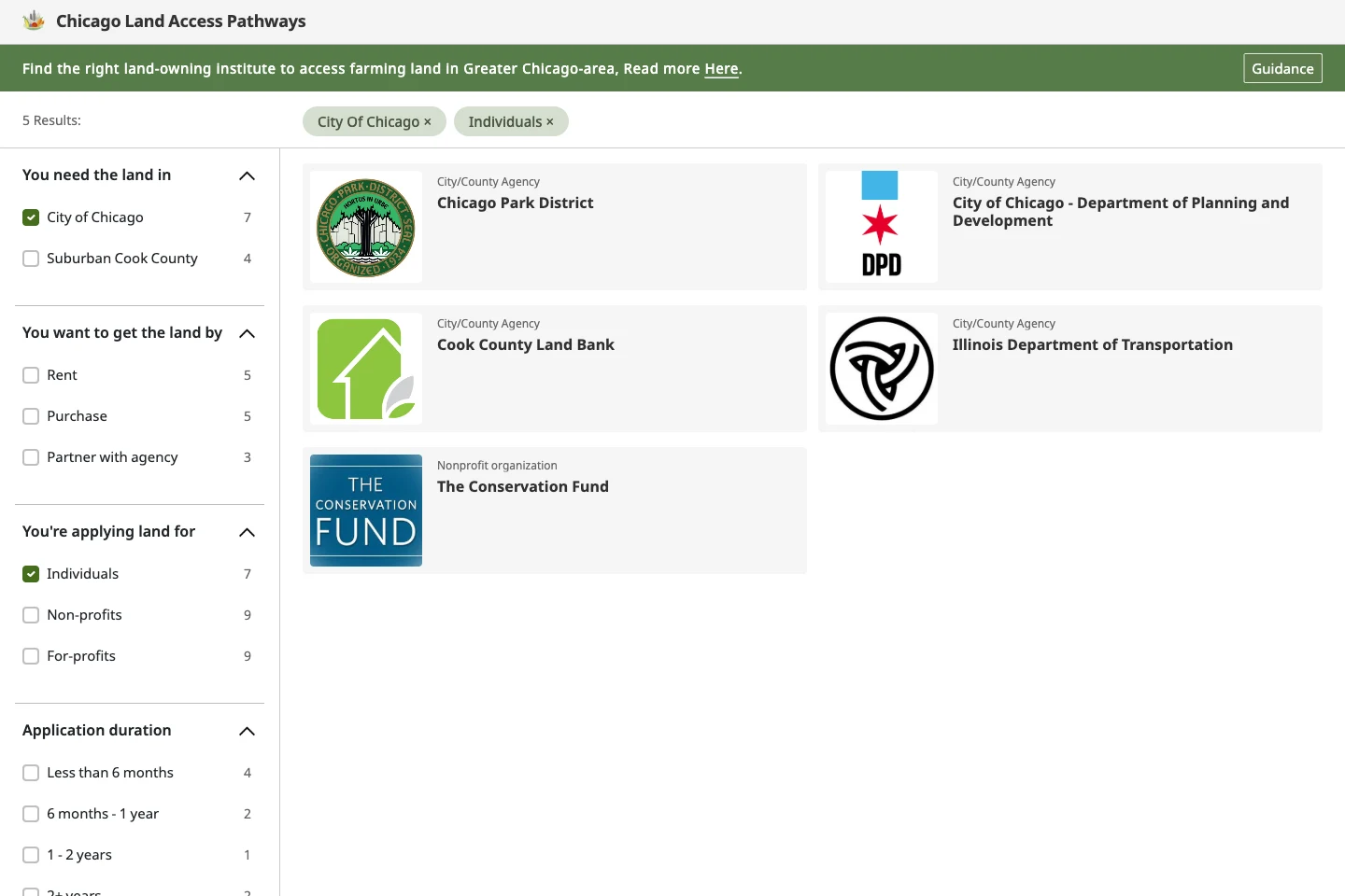
Turn institution requirements into useful filters
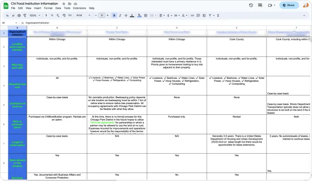
We interviewed more than 10 local land-providing institutions and consolidated their requirements into a spreadsheet. The useful structure was not a list of organizations alone: it was a way to compare where they operate, who they work with, and how land can be accessed.
Geographic coverage
- Grower’s question
- Where do I need land?
- Product decision
- Location filter
Rental, sale, or partnership
- Grower’s question
- How can I access it?
- Product decision
- Access-method filter
Applicant eligibility
- Grower’s question
- Who can apply?
- Product decision
- Applicant-type filter
Application timing
- Grower’s question
- How long does the process take?
- Product decision
- Application-duration filter
| Institutional information | Grower’s question | Product decision |
|---|---|---|
| Geographic coverage | Where do I need land? | Location filter |
| Rental, sale, or partnership | How can I access it? | Access-method filter |
| Applicant eligibility | Who can apply? | Applicant-type filter |
| Application timing | How long does the process take? | Application-duration filter |
Application duration is separate from the length of a lease.
Find a relevant institution, then check its conditions
The platform helps people identify an institution to work with. It does not promise an available parcel or make an eligibility decision. A short route from requirements to an institution’s details keeps that purpose clear.
The path to an informed first contact
The path to an informed first contact
-
Location & applicant
Access & timing
-
Review institutions
-
Read requirements
-
Contact the institution
↩ Understand the terms → Set requirements (Adjust the requirements)
- Screen/action
- Start/end
Inspect the page structure
Find an institution: location, access method, applicant type, and application duration.
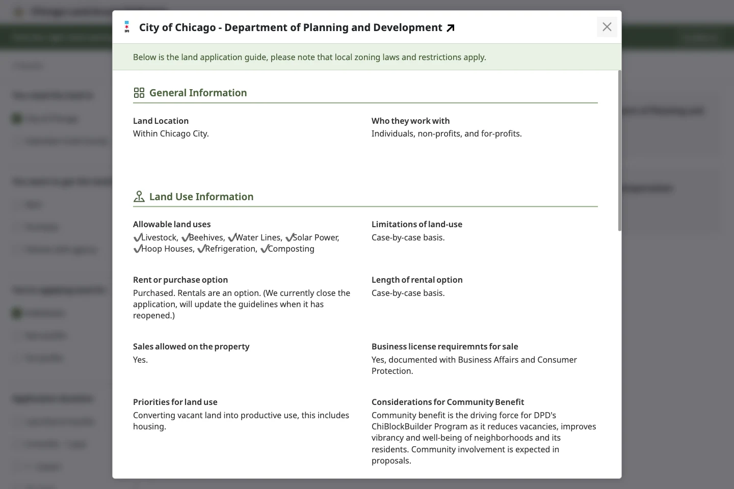
Agency details: general information, land use and finances, application process, timing, and contact.
Help along the way: three-step guidance, term explanations, and other resources.
Core decision
Directory before geography
Choose a directory to compare institutional requirements
We explored embedded lists, visual diagrams, a map-based website, and a separate filter-and-detail experience. The central task was comparing institutional conditions. We chose a directory that could expose those conditions without the build cost of a map.
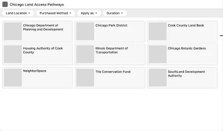
Explore the matching task: set requirements, then choose an institution.
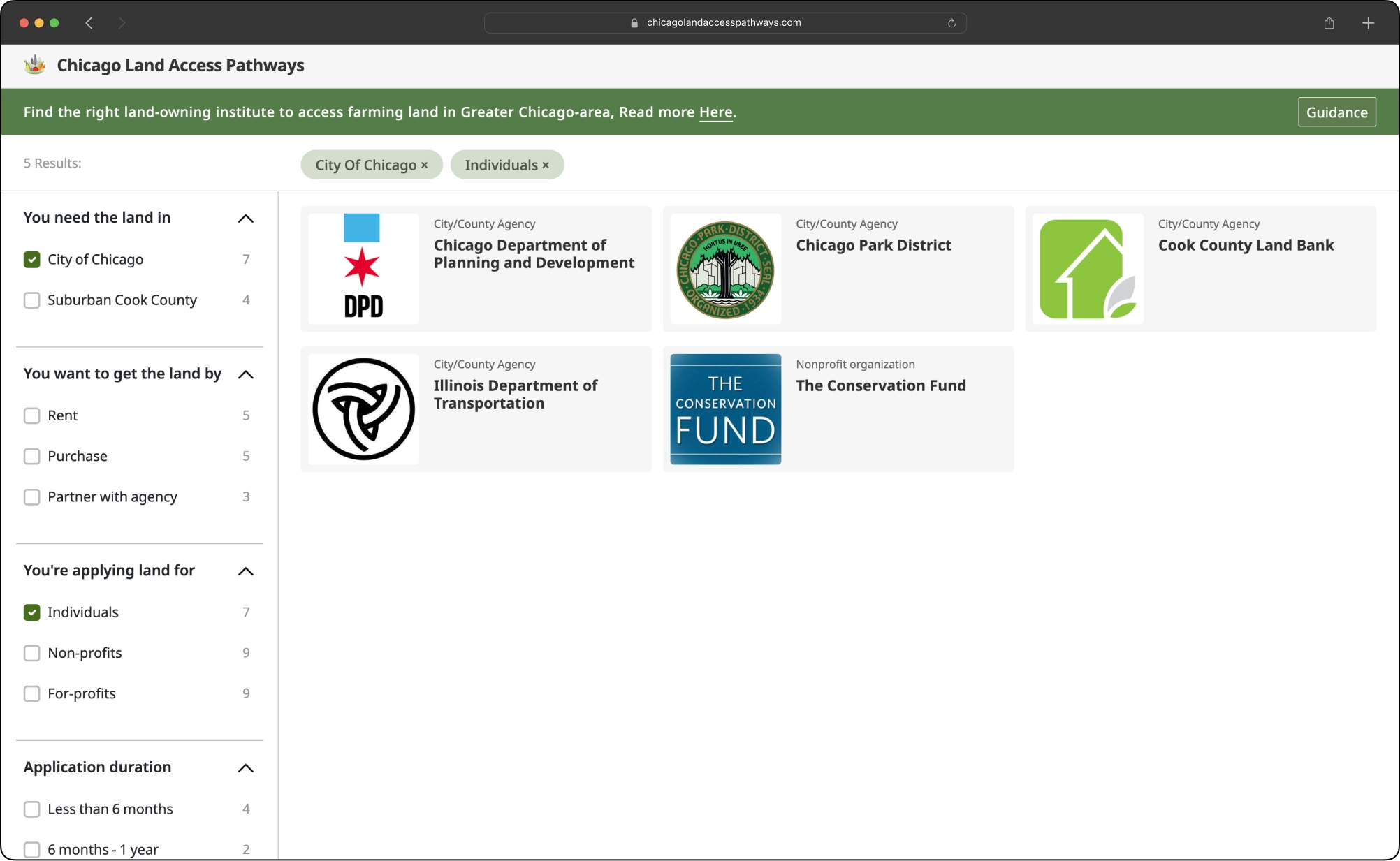
Requirements stay beside the matching agency cards.
Carry the matching question from the wireframe into the interface.
The working interface retains the wireframe’s filter-and-detail structure.
Map-based website
- Useful for
- Exploring geographic coverage
- Constraint
- Higher build cost; geography alone does not explain eligibility
Filters + agency details · chosen
- Useful for
- Narrowing options, then reading requirements
- Constraint
- Needs clear labels and guidance for first-time visitors
| Approach | Useful for | Constraint |
|---|---|---|
| Map-based website | Exploring geographic coverage | Higher build cost; geography alone does not explain eligibility |
| Filters + agency details · chosen | Narrowing options, then reading requirements | Needs clear labels and guidance for first-time visitors |
Qualitative trade-offs, not scores.
The two other approaches
Embedded list: a simple addition to an existing webpage, but long, structured answers become difficult to scan.
Visual diagram: useful for showing relationships at a glance, but detailed agency information still needs a reading view.
Keep the requirements beside the results
Narrow the agency list, then open an institution’s conditions. Selecting an agency shows its requirements and application information in one place, so the next step is grounded in the institution’s own process.
First-time visitors needed a clearer way in
We invited local growers, institutional representatives, and interaction experts to try the prototype. New visitors struggled to understand what the platform would do, how to use the filters, and what unfamiliar terms meant. Those findings shifted the iteration toward explanation at the point of use.
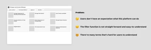
Unclear purpose on arrival
- Design response
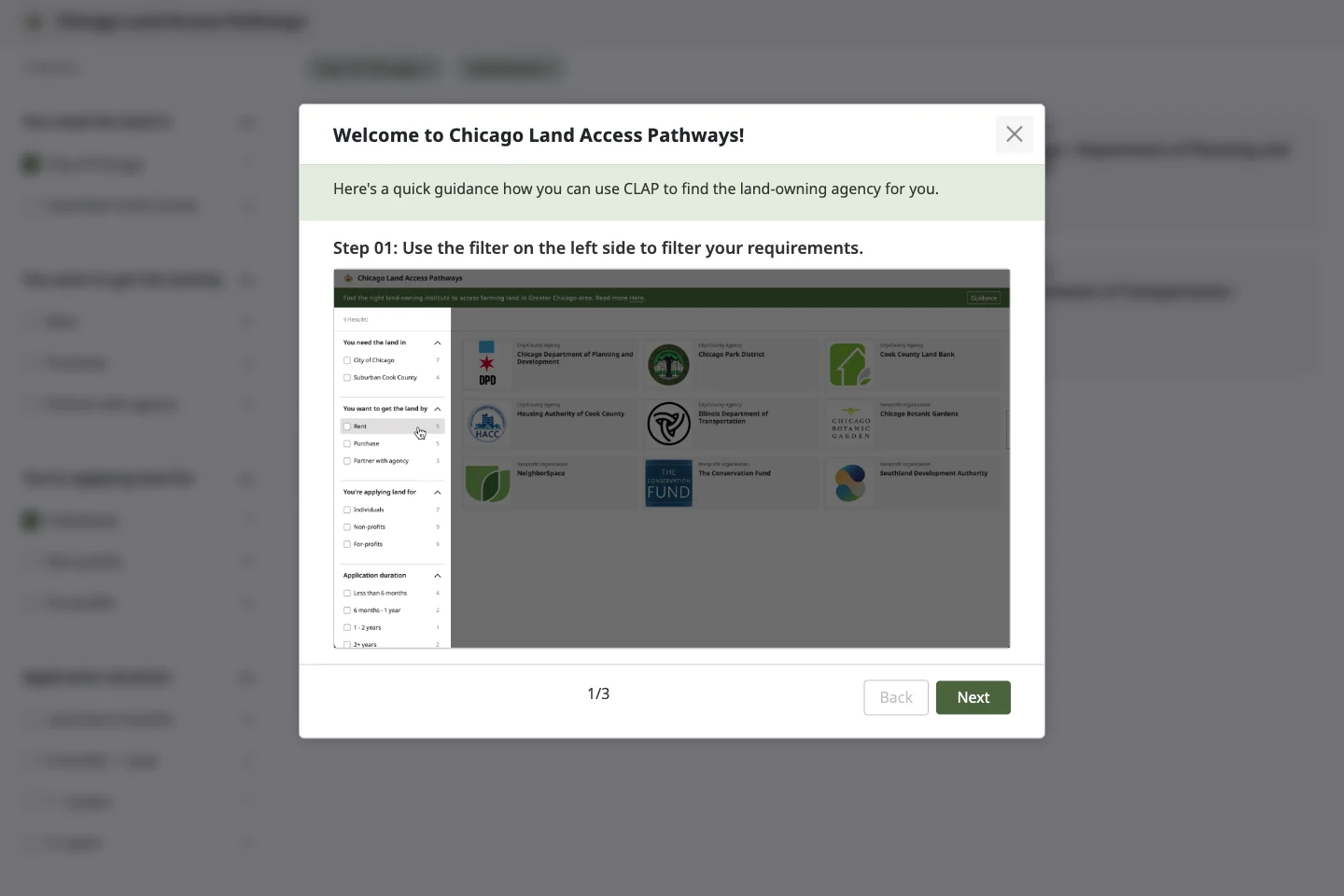
- A short, three-step tour
- Intended benefit
- Set expectations before searching
Filters were difficult to understand
- Design response
- A labeled side panel
- Intended benefit
- Give each filter group room to explain itself
Unfamiliar institutional language
- Design response
- Explanations beside the terms
- Intended benefit
- Read definitions without abandoning the application guide
| Observed problem | Design response | Intended benefit |
|---|---|---|
| Unclear purpose on arrival | A short, three-step tour | Set expectations before searching |
| Filters were difficult to understand | A labeled side panel | Give each filter group room to explain itself |
| Unfamiliar institutional language | Explanations beside the terms | Read definitions without abandoning the application guide |
Prototype-test findings and the corresponding design changes.
Explain filters and terms where people use them
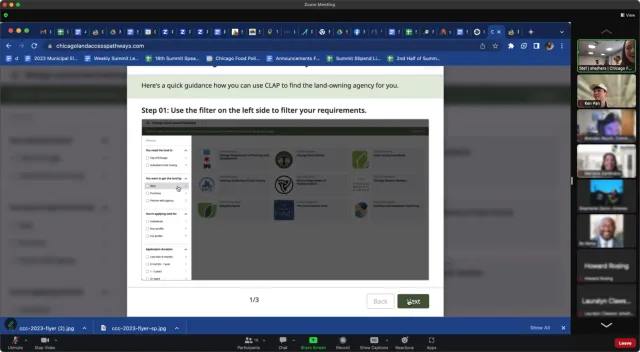
The tour introduces the three steps: filter requirements, choose an institution, then read its details. The revised side panel turns filter headings into questions, while term explanations help readers interpret institutional language.
Loading image…
Loading image…
Loading image…
Image 1 of 3
Support the same task on a phone
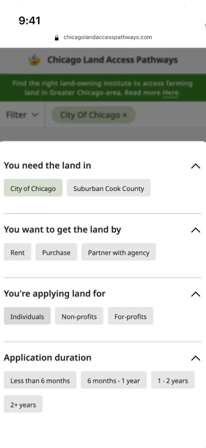
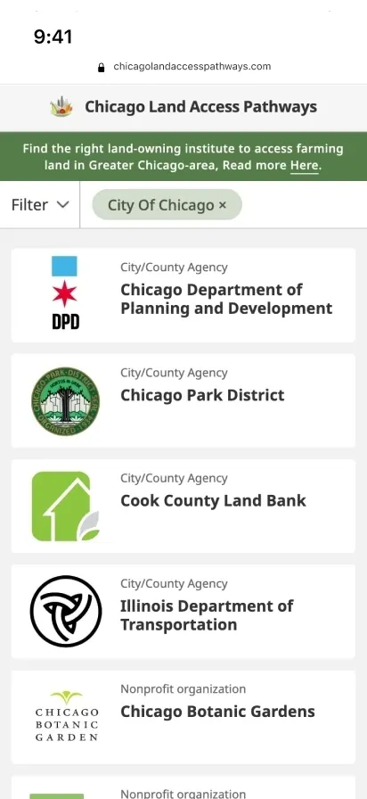
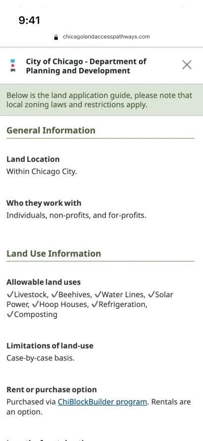
Desktop access could not be a prerequisite. On a phone, filtering becomes a separate sheet, the agency list stays readable, and details open in a focused view. The sequence remains the same: set requirements, review a match, understand the process.
01 · Set requirements

02 · Review a match
03 · Understand the process
Keep filters, cards, and guidance consistent
Noto Sans, a restrained green accent, and simple surfaces keep the directory legible. The working specimens below show the small decisions that carry the task: filter labels, selected states, agency cards, and guidance.
One connected task
Try a filter, open an agency, or start the guidance.
Inspect color and type foundations
Land & paper
Noto Sans
The content had to stay maintainable after launch
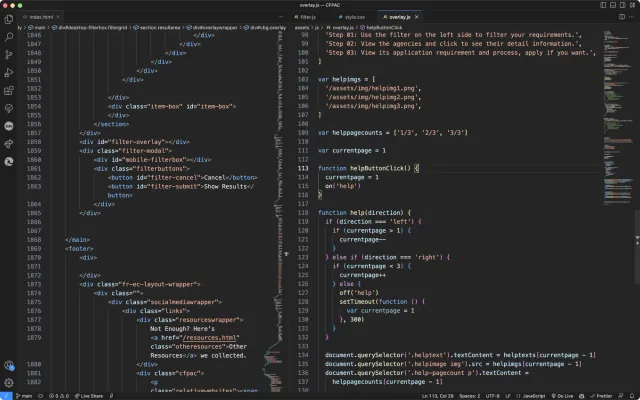
Working with a director and researcher at the Chicago Food Policy Action Council, I also developed the frontend. HTML, CSS, and JavaScript implement the responsive interface; jQuery drives filtering and overlays, and Contentful keeps institutional information separate from its presentation.
From institutional information to the interface
From institutional information to the interface
Source
Research and updates
- Institutional requirements
Content
Contentful
- Structured agency entries
Interface
HTML · CSS · JavaScript
- Filters & results
- Details & guidance
Launched; usage and land placements were not measured
The platform launched around spring 2023. Completed land placements were not measured.
What remained open: the launch-time analytics snapshot did not provide meaningful usage data. The team wanted to understand whether people would return to the platform or use it once.
I love the user-friendly nature of it, terrific job!
More case studies
All workFrom tabs to ideas
I designed this research canvas from 0→1 as the solo product designer. Launched on desktop and web.
SenseTime’s design reference, redesigned
I designed the reference and reading pages in a four-person team. Launched internally.
Returning to the Old Summer Palace
Stage visuals and motion for Renwen Tsinghua’s lecture on the palace’s reconstruction.