Animated stickers for a veterinary brand
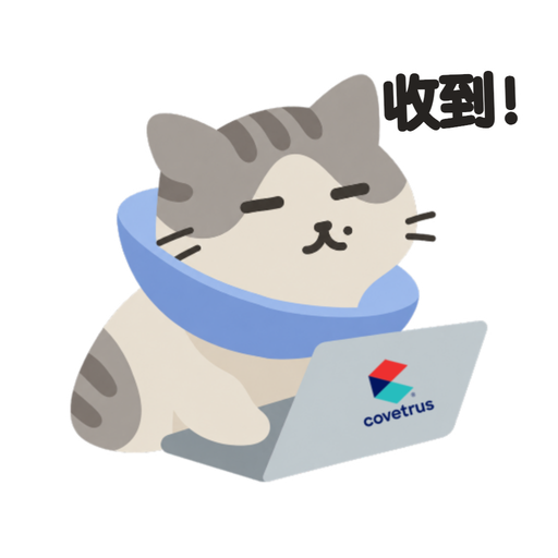
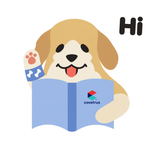
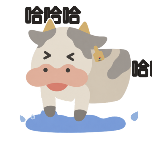
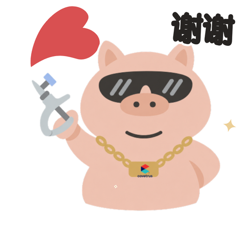
Five WeChat characters, each built around one of the brand’s products.
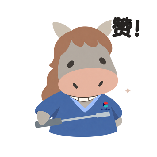
The project
I designed and animated five WeChat stickers for a veterinary-device brand, each featuring one of its five best-selling products. My work covered style research, character design, revisions, and animation delivery.
My role
Designer & Animator
Status
Delivered
Build five characters around five products
The client did not ask for characters. They asked for five stickers to promote their five best-selling products: an Elizabethan collar, a hoof bath, a pet bandage, an animal syringe, and a dental float. Each product picked its own animal, and each animal had to hold its product in a way a person would still want to send.
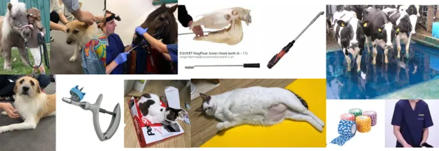
The problem
The product needs to be recognizable. The sticker needs to be worth sending.
Stage 01
Style
Combine the two approved style directions
I put four directions in front of them before drawing anything final: a hand-drawn cute style, a realistic anthropomorphic one, a personalized comic style, and a semi-anthropomorphic hybrid. The choice was not about taste. It was about how much detail survives at 120 pixels in a chat window, and how much personality a medical brand was willing to carry.
The client chose two: hand-drawn cute for the line, and the realistic anthropomorphic reference for how much animal to keep. The pack was drawn between them.
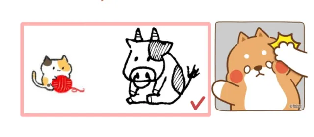
Loading image…
- Benefit
- A wobbly line still reads at thumb size, and it makes a clinical product look approachable.
- Trade-off
- Little room for a recognizable device: the prop has to be simplified almost to a symbol.
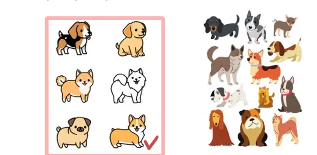
Loading image…
- Benefit
- Breeds are identifiable, which matters to an audience that works with animals all day.
- Trade-off
- Accuracy pulls toward a catalog; the characters stop being funny enough to send.
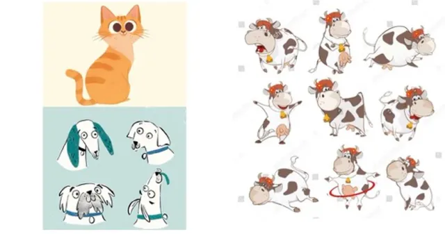
Loading image…
- Benefit
- The strongest personality of the four, and the widest range of poses per character.
- Trade-off
- Texture and fine linework collapse at sticker size, and the tone sits far from a medical brand.
Too much style between the reader and the product.
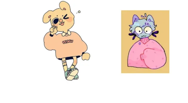
Loading image…
- Benefit
- Clothing gives an obvious place to put scrubs, badges, and branding.
- Trade-off
- Fully dressed, upright animals read as a mascot family rather than as patients and staff.
The clothing idea came back later, on one character, once the cast became staff.
DecisionHand-drawn
Survives the size the sticker is seen at.
Style reference boards shown to the client. The approved character drawings appear in the following sections.
Stage 02
Iteration
Use the revisions to clarify character roles and branding
The set went through close to 10 drafts. Looking back, very few of them were about drawing. In the early rounds, the client and I were discovering what “promote the product” actually meant to them — whether the animals were patients or staff, whether branding could appear on props, how visible the device had to be.
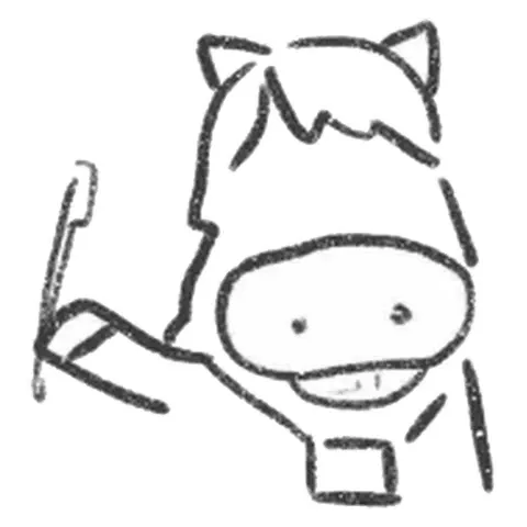
The dental float and pose establish the character’s job before color and clothing.
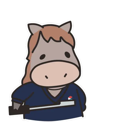
The same product stays recognizable. Scrubs and a smaller clothing mark make the horse read as staff.
Keep the product; resolve who the character is.
Draft 2 line artwork and a still from the delivered GIF. The intermediate color drafts below show the separate decision to move branding off the animals’ bodies.
Inspect the branding change in Drafts 4 and 9
Draft 4: the mark sits on the cow’s flank and the horse’s chest.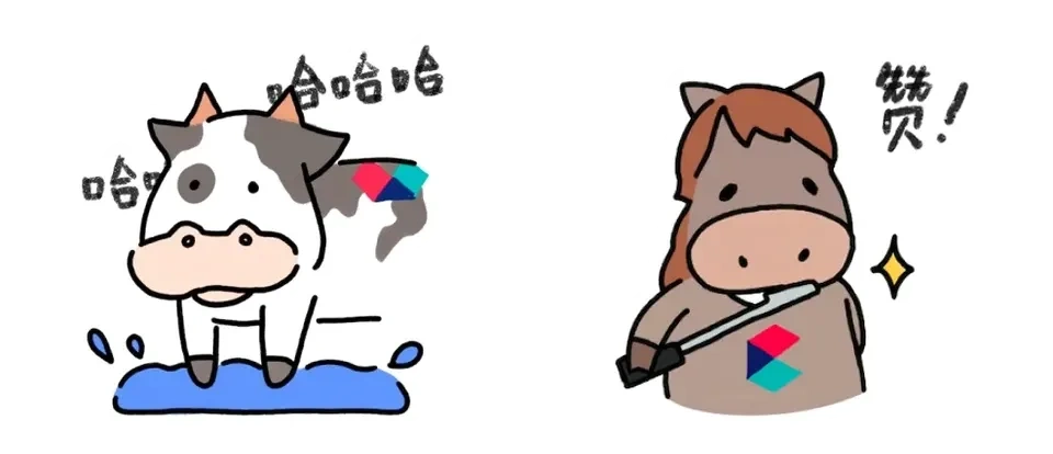
Draft 9: the mark moves to the ear tag and veterinary scrubs.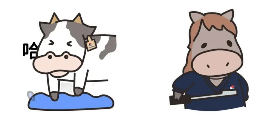
What I changed on the next project
Starting to draw before agreeing on the brief led to extra revisions. On the next project, I asked the client to approve a one-page list before sketching: character roles, required product details, and permitted brand placement. The later rounds here already worked this way, and they moved faster.
Stage 03
Production
Separate the artwork into parts for animation
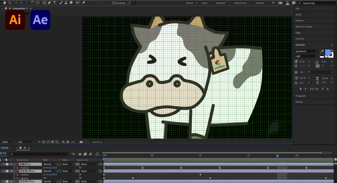
I sketched in Procreate and finished the artwork in Photoshop and Illustrator. For animation, I separated each approved character into head, ears, limbs, and props, then gave those layers independent keyframes in After Effects.
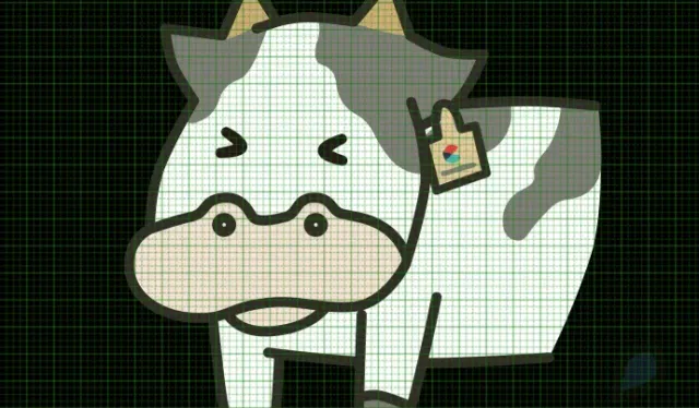

Loading image…
View the complete animation workspace
Stage 04
Delivery
Back in the window where the sticker has to work
A sticker has to read at thumb size, next to somebody else’s message. Tap one in the keyboard to send it into the group.
Chat placement mock · The original artwork was refined with AI assistance for this demonstration.
-
Rescheduled the dental for Thursday 👍
-
-
haha, send that one again
Tap a sticker to send
Sent to the group 03 / 05
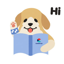
Dog
Carries the pet bandage
The bandaged paw is the greeting. The product does the waving, so the sticker works before anyone reads the brand.
From early drafts to the current set
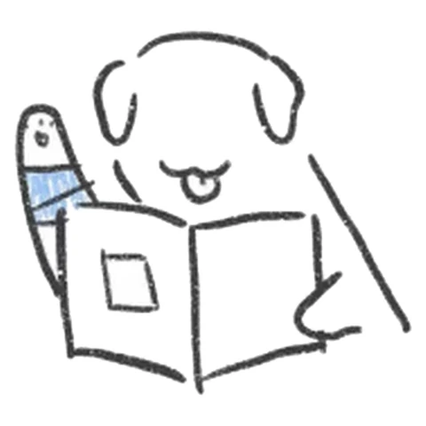 01 Line Draft 2 Draft 2, Procreate. Pose and prop only — if it does not read here, color will not save it.
 02 Color Draft 4 Draft 4. Color and expression are settled; where the brand mark sits is still being decided.
- 03 Motion What gets sent Chat preview Anticipation, a quick gesture and a delayed follow-through make the expression readable in a short loop.
Read the production steps
Line. Draft 2, Procreate. Pose and prop only — if it does not read here, color will not save it.
Color. Draft 4. Color and expression are settled; where the brand mark sits is still being decided.
Motion. Anticipation, a quick gesture and a delayed follow-through make the expression readable in a short loop.
Delivered stickers, with animation the client recognized
The set was delivered and the client was satisfied with it — specifically with the animation, which they felt caught the way cats and dogs actually behave. The drawing got the products into a chat window; the motion is what made the characters feel like animals rather than mascots.
The lesson took 10 rounds to learn and one line to state: on a character project, the requirement is the deliverable that has to be agreed on first. Everything after it is craft.
More case studies
All workLand access for Chicago growers
I researched, designed, and built a live directory helping Chicago growers compare land providers and understand how to apply.
From tabs to ideas
I designed this research canvas from 0→1 as the solo product designer. Launched on desktop and web.
SenseTime’s design reference, redesigned
I designed the reference and reading pages in a four-person team. Launched internally.